
Ultimate guideline on choosing a responsive Shopify theme
In today's omnichannel eCommerce world, responsive store design contributes a significant part to a store’s success. Google loves responsive. Your customers feel pleasant when browsing a responsive Shopify store. Your store looks best when it goes with responsiveness. But what makes a theme responsive? If you are not a developer or designer, or you are a newbie just starting your online store, this post is written for you. Let's explore the core pluses of a responsive Shopify theme, and most importantly, how to know if the theme you are using goes with responsiveness or not.
[box1 img_url="https://cdn.shopify.com/s/files/1/1825/0729/files/checklist-cover.png?18263190224637273162" title="Christmas promotion toolkit" sub_title="Free download" content="All the brilliant promotion ideas and sale boost action that help you win Christmas sales 2017" file_url="https://www.sellersmith.com/pages/shopify-christmas-promotion-kit?utm_medium=inline-blog" button_text="Free download now"]
Benefit #1: Enhanced user experience
A responsive Shopify theme provides a better user experience. In eCommerce, that means an improvement in product browsing, search, and purchase flow.
For example, you don't have to slide your fingers to zoom out/zoom each product images. You don't either have to scroll through distracting elements to find what you need in the store. A Shopify theme with responsive-ready can either minimize or hide optional elements on small screens.

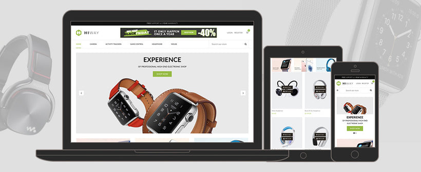
Take a look at the navigation menu on our Electronics Store theme. On the above GIF image, you can see that the menu has been minimized as the hamburger style on mobile for a better experience.
Benefit #2: Higher SEO Rankings
If you are considering to choose SEO as a marketing channel, go for a Shopify theme with responsive design. Google bot prefers mobile-friendly websites. First, responsive design makes it easier and faster for the Google bots to crawl, index, and organize SEO data. Second, one single store's URL means it'll be simpler for content sharing across devices on social media channels.
Benefit #3: Boosted mobile purchase
Mobile commerce is rising globally. According to a report namely “2016 US Cross-Platform Future in Focus" of comScore indicated that mobile is becoming the first touch point in digital with 65 percent of digital time spent, while desktop usage is decreasing under 35 percent.

Mobile purchase leads one-third of the eCommerce world. Thus responsive Shopify store will bring you more money.
Benefit #4: Less management and tracking effort
If you separate your store’s address for X devices, you have to take the time to take care of X website versions. That means more time for setup, customization, and tracking. Moreover, you will have to prepare separate desktop and mobile SEO plans.
In the first stage, you don't have that much time and budget for that significant amount of store's versions and marketing effort. So choose responsiveness, and you can save that time portion for other essential works.
How to check the responsiveness of a Shopify theme?
Before downloading or purchasing a theme, you need to make sure that it is responsive on all devices.
There are 3 ways to review whether a Shopify theme is responsive or not: manual method, browser tools, and responsive checking tools.
Manual method
The concept is simple: check the Shopify theme demo on mobile and desktop at the same time. For mobile, use as many mobile devices you have (iPhone, iPad, tablet, laptop with a small screen, old laptop and mobile devices). You can also borrow your friend's or relative's devices for testing purpose.
If you need a sample for testing, check this Watch Store theme.
Some suggestions to help you finish this manual test:
- Do the desktop and mobile version follow the same concept?
- Are content texts easy to read? Is there any paragraph poorly aligned?
- Do all pictures on the desktop display well on the mobile version as on the desktop version?
Browser tools
If you can't have many devices for testing, you can use the inspect feature on your web browser.
on 3 top popular browsers: Chrome, Firefox, and Safari.
On Chrome
On the theme demo page, right click then chooses Inspect. Then turn on device preview, and pick a device on the list.

If you want to view more devices, click on the arrow on the device list, then choose Edit, and check to show the devices you want to have a preview.
On Firefox
Opening Inspector on Firefox is similar to that in Chrome.
On the Firefox browsing window, right click to select Inspect to open Inspector. Then switch to Responsive Design Mode, and choose your screen size preferences.

On Safari
On the Safari browser window, choose Menu > Safari > Preferences…, then switch to the Advanced tab, then mark the option Show Develop menu in menu bar.
The “Develop” menu is now available. Switch the preview to any device you want via Menu > Develop > User Agent.

Responsive checking tools
If you don't want to use the 2 above methods, you can use a free tool to check whether a Shopify theme is responsive or not.
Below are some tools that can help you test Shopify theme's responsiveness:
- http://www.viewlike.us/
- https://www.responsinator.com/
- http://designmodo.com/responsive-test/
- http://responsivepx.com/
- http://mattkersley.com/responsive/
- http://responsivedesignchecker.com/
- http://responsivetest.net/
- http://responsive.is/typecast.com
- http://quirktools.com/screenfly/
- http://respondr.webhoard.net/
Besides, the mobile-friendly test of Google is also a proven one to confirm whether your store has been optimized for mobile yet.
[quotes content="Download free Shopify Booster theme" link="https://www.sellersmith.com/pages/free-shopify-booster-theme-all-in-one" link_text="Download now"]
What's better than responsiveness?
As mentioned in above sections, you should choose a responsive Shopify theme, as well as check whether it has been responsive or not.
But is there anything better than that?
Yes. It’s mobile-first design.
The below graph clearly illustrates the difference between responsive and mobile-first design.

(Image resource: Soulful Hustle)
While responsive design starts from the biggest screen, mobile-first one starts on the smallest on, then adapt the design on bigger ones. As announced in the Shopify Unite 2017 in San Francisco, the mobile-first design is the new responsiveness. The mission of mobile-first design is to boost conversion rate on mobile devices. Shopify Plus Blog also mentioned about this new design trend.
“... it can make you more money. A big part of going mobile first is making your site load faster. Decreasing your site’s loading speed matters.”
So if you haven't chosen a theme for your store, you’d better find a responsive Shopify theme that follows the mobile-first design philosophy. This kind of theme will save much of your time in the launching period and further business growth periods in the long run.
[box1 img_url="https://cdn.shopify.com/s/files/1/1825/0729/files/checklist-cover.png?18263190224637273162" title="Christmas promotion toolkit" sub_title="Free download" content="All the brilliant promotion ideas and sale boost action that help you win Christmas sales 2017" file_url="https://www.sellersmith.com/pages/shopify-christmas-promotion-kit?utm_medium=inline-blog" button_text="Free download now"]

Related posts

← Older Post
Newer Post →
